Help
Help Dot plot guide: How to read Fed rate signals
The Fed dot plot shows the anonymous interest rate projections of 19 Federal Open Market Committee (FOMC) members. Introduced in 2012 to guide market expectations, it helps traders assess future policy direction and wider economic signals.
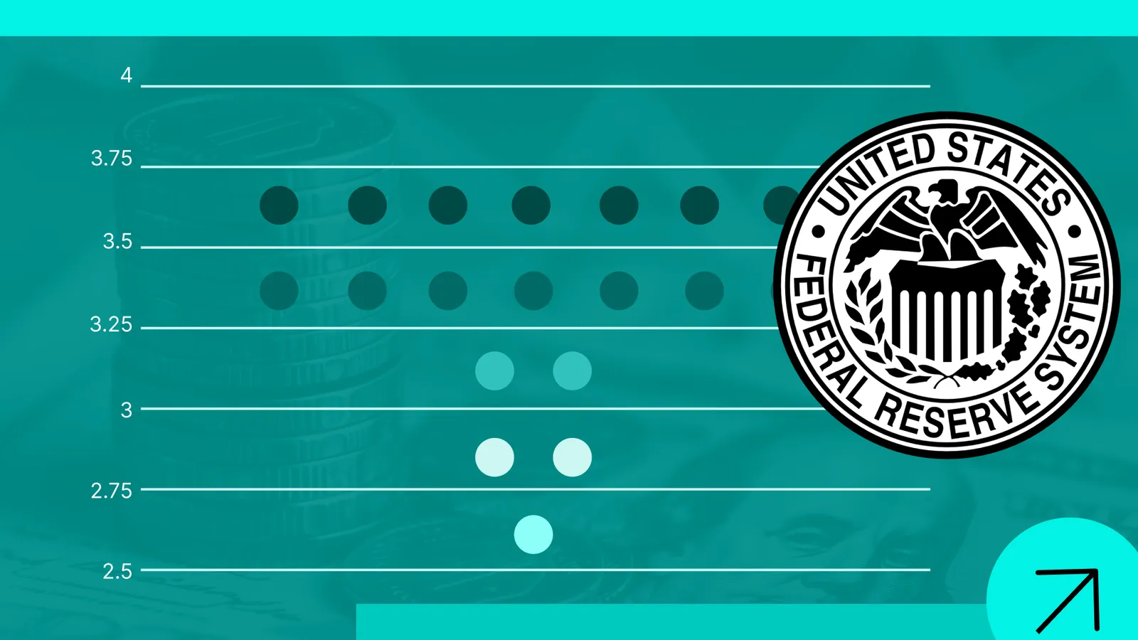
The dot plot reflects anonymous individual estimates from the 19 Federal Open Market Committee (FOMC) members on the future path of monetary policy.
Looking at the median projection and the spread of estimates can help market participants assess whether policy expectations are becoming more hawkish or dovish.
The projections are closely linked to key economic indicators, including Gross Domestic Product (GDP) growth, unemployment and inflation trends.
Because the dot plot reflects individual views rather than a fixed forecast or policy commitment, it can change as economic conditions and market uncertainty evolve.
What the Fed Dot Plot is and why it matters
The Fed Dot Plot outlines the individual projections of Federal Open Market Committee (FOMC) members regarding the likely path of benchmark interest rates over upcoming periods. It is commonly published within the official documents of the Federal Reserve as a core component of the Summary of Economic Projections (SEP).
Its primary value lies in its power as an analytical tool for formulating market estimates. Financial market participants utilise it to project macroeconomic trends based on the probable direction of interest rates, assess the downstream effects of benchmark rates on equity valuations, and evaluate potential currency fluctuations—particularly the valuation of the US dollar relative to other major global currencies. Furthermore, given the influence of the Federal Reserve as a leading central bank, the Dot Plot provides critical insights into the broader monetary policy pressures facing other global central banks.
Why the Dot Plot was created
The Fed Dot Plot has been published since 2012 under the premise that enhanced transparency regarding the central bank's rate trajectory would allow market participants to better align key macroeconomic variables, such as inflation, with real-world economic mechanics. By clarifying the FOMC’s expectations, economic agents—including businesses and consumers—can proactively adjust their consumption and capital investment strategies in accordance with projected monetary policy.
How it differs from a Fed forecast
The Fed Dot Plot offers a probabilistic snapshot—not a policy commitment—of interest rate trajectories over future horizons. Unlike an official central bank forecast, which might be interpreted as a predetermined roadmap, the Dot Plot merely aggregates the individual opinion of each committee member based on prevailing economic conditions. Consequently, the distribution of dots across the plot can alter dramatically from one meeting to the next as shifts in the macroeconomic landscape alter individual member perspectives.
Who makes the Dot Plot and what each dot represents
The Fed Dot Plot is constructed directly from inputs provided by the members of the Federal Open Market Committee (FOMC). This governing body comprises 19 participants, including the members of the Board of Governors and the regional Federal Reserve Bank presidents.
FOMC participants and anonymous projections
The Federal Reserve Board of Governors consists of 7 members who hold permanent voting rights on official interest rate decisions. Alongside them are the 12 regional Federal Reserve Bank presidents. Within this regional group, only the President of the Federal Reserve Bank of New York holds a permanent vote, while the remaining 11 presidents share four rotating voting seats on an annual basis. However, when formulating individual rate projections for the Dot Plot, all 19 participants—voters and non-voters alike—contribute their individual assessments.
How to read the Fed Dot Plot
The horizontal axis of the Dot Plot displays the projection time horizons, which include assessments for the current year, the subsequent two calendar years, and a final column designated as the "Longer Run" rate target. The vertical axis represents the projected federal funds rate expressed as a percentage. Each individual dot corresponds to the assessment of a single participant, rendered entirely anonymous so that specific projections cannot be attributed to individual members.
Market participants primarily focus on the median of the distribution to infer the most probable path for monetary policy. Additionally, investors view a tight cluster of dots with low dispersion as a sign of strong consensus within the committee. Conversely, a widely dispersed distribution indicates significant disagreement or uncertainty among members regarding the future trajectory of interest rates.
Finally, market participants closely scrutinize the positional bias of the dots relative to current policy levels. For example, if the prevailing federal funds rate is 3.5%, but 12 participants project a rate of 4.0% for subsequent periods, this reflects a predominantly hawkish outlook among committee members. Conversely, if the majority of dots lie below current levels at 3.0%, this indicates an expectation of monetary easing (a dovish bias). Analytical measures such as the median or average projection typically align with this distributional bias.
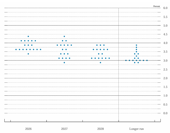
Figure 1. Fed Dot Plot (example). Source: Figure obtained from the Federal Reserve’s Summary of Economic Projections.
Connecting dots to inflation, jobs, and growth projections
Interpreting the Dot Plot cannot be done in isolation from the broader macroeconomic projections issued by the Federal Reserve. Consequently, market participants evaluate the chart alongside corresponding estimates for Gross Domestic Product (GDP) growth, the unemployment rate, and inflation metrics (including both headline and core Personal Consumption Expenditures).
If the central bank anticipates an economic slowdown accompanied by rising unemployment, the resulting Dot Plot will generally reflect a dovish trajectory aimed at stimulating growth. Conversely, if economic overheating and escalating inflation are forecast, the Dot Plot will lean towards a hawkish profile characterized by higher policy rates. The most complex scenario occurs when estimates point to stagnant or contracting growth, elevated inflation, and rising unemployment—a combination characteristic of stagflation.
Limitations, risks, and common mistakes
Although the Fed Dot Plot is an invaluable analytical tool for financial market participants, it carries distinct limitations and potential risks if relied upon inappropriately.
Why you should not overweight the Dot Plot under uncertainty
The projections displayed within the Dot Plot reflect economic conditions and information available at the exact moment the chart is produced. During periods of heightened macroeconomic volatility or structural uncertainty, the projections submitted for subsequent iterations can shift markedly. Relying too heavily on a single Dot Plot release to guide long-term investment decisions can therefore expose market participants to policy misalignments.
Could the Dot Plot be changed or removed
The inclusion of the Dot Plot within the Summary of Economic Projections (SEP) remains entirely at the discretion of the Federal Reserve. The central bank retains the authority to alter its presentation, modify its structure, or discontinue its publication altogether. Because the Dot Plot is not a statutory requirement mandated by law, its ongoing release depends entirely on the Federal Reserve's internal communication strategies and monetary policy objectives.
Conclusion
The Fed Dot Plot serves as an essential framework for market participants by offering transparency into the FOMC's monetary policy expectations. However, it should be utilized as a dynamic, probabilistic guide rather than an unyielding commitment or policy promise. By synthesizing Dot Plot trends with core economic indicators such as inflation, employment, and GDP growth, investors can establish a comprehensive macroeconomic outlook—enabling them to strategically adapt their financial positions in response to ongoing market volatility and structural shifts.
If you're interested in trading indices, foreign exchange, shares, or commodities, consider exploring the CFD contracts offered by Equiti Group. Please note that trading leveraged derivatives involves a high level of risk and may not be suitable for all investors.
FAQs
What is the Fed Dot Plot and why is it relevant to markets?
The Fed Dot Plot is a chart published within the Federal Reserve's Summary of Economic Projections (SEP) that displays the individual, anonymous rate projections of the 19 FOMC members. Introduced in 2012 to enhance monetary transparency, it helps market participants anticipate policy shifts and align their investment and consumption decisions with the central bank's perspective, providing key context for evaluating equities, foreign exchange rates, and broader economic conditions.
How is the Dot Plot different from a conventional economic forecast?
The Dot Plot does not represent a binding commitment or a definitive policy path; rather, it reflects the individual expectations of FOMC members based on data available at a given moment. Unlike formal institutional forecasts, the dots are anonymous and subject to rapid revision between meetings if underlying macroeconomic conditions shift, making it a representation of evolving sentiment rather than a fixed operational blueprint.
How should the distribution and bias of the points in the graph be interpreted?
Analysts focus on the median projection to determine the most likely policy trajectory. A compact distribution indicates strong consensus within the committee, whereas high dispersion points to elevated policy uncertainty. Furthermore, positional bias provides directional context: a cluster of dots above current interest rates signals a hawkish orientation, while a concentration below current levels points toward prospective monetary easing (a dovish stance).
What are the main limitations and risks of using this tool?
The primary limitation of the Dot Plot is its point-in-time nature; during periods of rapid economic change, projections can quickly become obsolete, leading to miscalculated decisions if treated as absolute forecasts. Additionally, as the chart is not legally mandated, the Federal Reserve maintains complete discretion to modify, suspend, or permanently remove the metric from its official publications at any time.