Golden and death cross patterns in trading
Read our article to understand the roles golden and dead cross patterns in predicting market trends and guiding investor decisions.

Golden and dead cross are chart patterns used in technical analysis to identify price trends
Golden cross signals an upcoming bullish market trend, whereas a death cross indicates a potential bearish market downturn
Golden cross pattern occurs when a shorter-term moving average (MA) crosses above a longer-term moving average, whereas death cross occurs in an opposite situation
Traders look for high trading volume to get a confirmation for the significance of these patters
Introduction to golden cross pattern
Market analysis is a key part of online trading as it allows traders to make more informed decisions and protect their capital. There are several approaches to analysing financial products with technical analysis being one of the most popular ones. Technical analysts use chart patterns and indicators to predict the future price movements and spot trading opportunities.
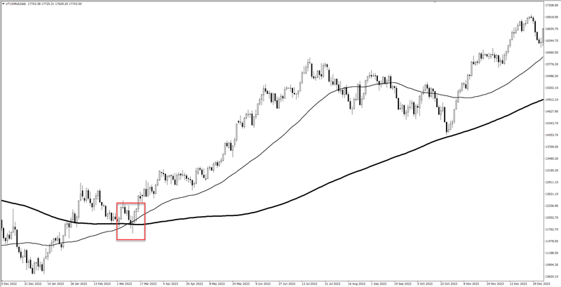
A golden cross is a chart pattern that often signals an upcoming uptrend in the market. The golden cross pattern tends to occur through a trio of specific stages: preparation for a rebound, key crossover and sustained ascendancy.
A golden cross pattern starts to form with a completion of a bearish trend that marks a preparation for the bullish reversal period. This means that the selling momentum has cooled to the extent of allowing a golden cross to form. Market dynamics are in favour of buyers, with a temporary dip in 50-day MA, which suggests control is shifting from sellers to buyers.
The key crossover is the point where a short-term MA crosses a long-term one. The most commonly used moving averages in the golden cross patterns are the 50-day and 200-day moving averages. This shift of moving the 50-day MA above the 200-day MA has the levelling effect on the price chart as buying pressure pushes prices upwards. Traders closely watch for clues that the market is really moving up rather than the movement being a temporary bounce.
Sustained ascendancy is the stage where the 50-day MA slowly becomes sustained in its upwards movement, confirming the maturation of bullish market sentiment. At times, it tends to be overbought for shorter lengths of time, since the uptrend takes root definitely. This stage seals the presence of the uptrend, hence, signalling an activated phase where both market activity and optimism are intensifying.
Death cross pattern explained
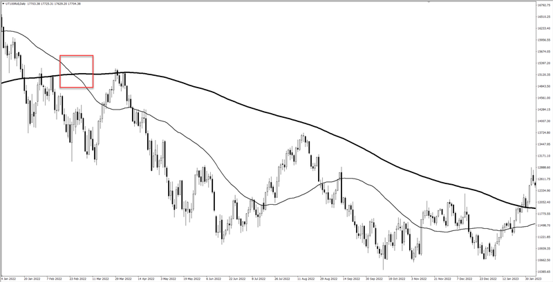
Death cross is the counterpart of the golden cross and it usually serves as a signal for bearish trends in financial markets. As the name suggests, a death cross normally works as a precursor to a long-term bear market. So far, the death cross has been related to some big economic crisis such as the stock market crash on Black Monday in 1929 or the 2008 financial meltdown.
The death cross pattern is formed by the short-term moving average crossing below a long-term MA, heralding the initiation of a bearish period. Typically, this event is signalled when the 50-day MA declines below the 200-day MA in a leading-up formation to a bearish phase.
The formation of the death cross pattern breaks down into three stages, representing a deeper plunge into bearish territory in each.
Prelude to the fall is the period that originates when short-term MA continues to dominate above the long-term MA and gives very subtle signs of a pending reversal.
When the short-term MA moves below the long-term MA, this is marked as a bearish reversal. This is very important stage, which shows the birth of a downtrend as the difference between the Mas becomes bigger, together with lowering rates.
As the 50-day MA continues to slope downwards and holds firmly below the 200-day MA, the market is officially in a state of downtrend, which increases selling pressure among traders bracing for more downside. For traders, this stage is the confirmation of the bearish trend.
How to use golden and death cross patterns in your analysis
The main difference between the golden cross and the death cross is that the golden cross is considered a bullish signal and the death cross is considered a bearish signal. The golden cross is a symbol for an uptrend, meaning the readiness of the market to set forth an upsurge in price. Conversely, the death cross is a harbinger of a downtrend, signalling an impending decrease in market values. Since these patterns give opposite signals, they also look opposite on the chart.
Both of these patterns can offer traders valuable insights and help to identify timings for buying and selling. For a more comprehensive technical analysis, traders should use golden and death cross patterns in conjunction with other technical indicators to better understand market conditions.
There is no tool in trading that is 100% accurate, and this also applies to golden and death cross patterns. They can give false signals and traders may want to wait for confirmation of the trend before making their move. Often the confirmation would come in the form of increased trading volume. Analysts for also keep an eye on moving average convergence divergence and relative strength index to confirm these signals.


