Candlesticks
Candlestick charting is a popular way to look at the price changes and sentiment of a financial asset. Read on to discover how to use them in trading.

Candlesticks are the most used charting type, and they are fundamental in assembling a well-rounded understanding and application of technical analysis
Candlesticks provide traders more details than other charting methods as they show four price points and provide information about trading volume and market sentiment
The rectangular part (or body) of the candlestick represents the final opening and closing prices during a timeframe, while the wicks and shadows (thin lines above and below) show the highest and lowest price of the asset reached during that time
Candlesticks can be used with other technical analysis indicators to provide additional insights and a more comprehensive view of the market
Introduction to candlestick charting
In trading terminology, a candlestick is a type of price chart used in technical analysis. It displays the high, low, open, and closing prices of a financial asset for a chosen time period which are represented in a series of candlestick shapes. These shapes form patterns which are used to identify market trends.
Candlesticks have a long history that pre-dates online trading. The method has its origins in 17th-century Japan, where it was developed for trading in rice markets. At that time, Munehisa Homma, a rice trader, used what would later become candlestick charts to predict the price movements of rice in Osaka’s Dojima Rice Exchange. His work was considered groundbreaking, and for centuries it remained a closely guarded trading secret in Japan.
The technique was made popular in the Western world by American author, Steve Nison, in the 1990s. Through his writings and teachings, Nison introduced traders to the complex patterns and meanings that could be gained from candlestick charts, and this led to a revolution in technical analysis tools for traders across the world.
Shape and anatomy of candlesticks explained
A candlestick consists of four main elements: the opening price (open), the closing price (close), the highest trading point during that period (high), and the lowest trading point (low). Let’s look at those terms in context, using a day-long timeframe for a given asset.
The opening price of an asset is its price at the beginning of the day and the closing price is the price the asset finishes at the end of the day. The area between the opening and closing price of the candlestick forms the body. Whether the opening price is at the top or bottom of the body will depend on price momentum. This means if there is no wick (or thin line at the top of the candlestick), the asset closed at the highest buy price during that time period. The next candlestick in the series will always align its body with the previous candlestick’s body, to show how the price continues to evolve across the trading chart.
The body of a candlestick is either green or red. Green generally indicates a bullish candlestick, where price momentum is strongly upwards, meaning there is more buying than selling. It is green because the price has risen compared to the candlestick before it. In this case, the opening price will be at the bottom of the body and the closing price will be at the top of the body. The red colour indicates a bearish candlestick, where price momentum is strongly downwards. This shows that the price has dropped in comparison to the candlestick before it. In this case, the opening price will be at the top of the body, and the closing price will be at the bottom.
The body of the candlestick can also be filled or empty, depending on the trading platform’s settings. In this case, filled means bullish and empty bearish. Some trading platforms offer custom colours, such as blue for bullish and white for bearish, but it’s important to remember their meaning if you chose a custom aesthetic.
The length of the body represents the difference between the opening and closing prices. If there has been lots of trading activity, whether bullish or bearish, the body will be longer. It’s always important to remember that each candlestick illustrates price action for a predetermined timeframe that you select.
Here is a visualisation to illustrate these terms:
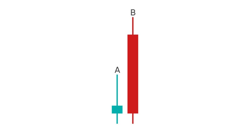
Candlestick A shows that within the timeframe of the candlestick there was limited trading activity (short body), and that there was a bearish sentiment (red body). Therefore, the opening price is at the top of the body, and the closing price is at the bottom of the body. This means the closing price was lower than the opening price at the end of the time period.
Candlestick B shows that there was strong trading activity (long body), and that the overall sentiment was bullish (green body). The opening price is at the bottom of the body, and the closing price is at the top of the body. This means the closing price was higher than the opening price at the end of the time period.
The thinner lines extending out from the body are referred to as wicks or shadows. They mean the same thing and can be used interchangeably.
Wicks and shadows symbolise the range between the highest and lowest prices during the chosen time period. Unlike the body and the changing position of the opening and closing price depending on the market sentiment, the upper tip of the wick illustrates the highest price that was achieved for that timeframe. The lowest point of the lower shadow illustrates the lowest price obtained for the asset in that timeframe. If the body of the candlestick rests at the top or the bottom of the thin line, it represents that the closing/opening price reached the furthest point during that time period.
Advantages of using candlesticks in market analysis
Candlestick charting is a fundamental tool for analysing financial markets for several reasons.
One of the most significant advantages is that it allows for informed decision-making as candlesticks offer traders with deeper understanding of the price changes. This helps traders make decisions based on a deeper grasp of market conditions, which generally leads to more successful trading plans.
Another key advantage of using candlestick charts lies in their versatility. These charts are suitable for all types of trading strategies, from high-frequency scalping to long-term investing. This flexibility comes from the ability to represent data in a variety of timeframes, providing traders the convenience to change their analysis to align with their trading goals.
Candlestick charting also offers psychological insights into market conditions. The appearance of specific patterns, such as the Bullish Engulfing or Bearish Harami, often act as signals for changes in market sentiment. Recognising these patterns provides traders with an edge, allowing them to anticipate market moves based on an understanding of the overall psychology of market participants.
Lastly, candlestick charts can work in synergy with other technical indicators to offer a wider analytical approach. For example, combining candlestick patterns with tools like the Moving Average Convergence Divergence (MACD) or the Relative Strength Index (RSI) provides traders a comprehensive toolkit for market analysis. This multi-faceted approach enhances both the depth and reliability of the trading signals, making it a powerful method for navigating the complexities of financial markets.
Candlesticks and other chart types
Candlestick charts are not the only chart types available for traders interested in using technical analysis. Line and bar charts are other commonly used chart types.
For example, line charts provide a simple view, plotting only the closing prices over a set time frame. This gives a straightforward view of the asset's general price action over the period. For more detail, a bar chart uses vertical bars to represent the trading range for each period, marking open, close, high, and low prices, just like the candlestick.
However, candlesticks provide some benefits over other chart types in several key areas:
Comprehensive data: A single candlestick provides four key data points, making it much more information-rich compared to line charts that only show the closing price.
Immediate interpretation: Their visual nature allows traders to instantly understand the state of the market, thereby aiding in quick decision-making. Many trading patterns are expressed with the use of candlestick patterns as their illustrative base.
Predictive value: The various patterns formed by candlesticks can serve as early indicators of future price movements, providing traders a hint of what’s to come in the market moving forward.
Compatibility with other techniques: Candlestick patterns can be used alongside other technical analysis tools and established patterns, providing a more robust framework for analysing market behaviour.


